Daly Accountants & Advisory Services
A modern, considered brand identity built around connection, trust and financial expertise.
- Client
- Daly Accountants & Advisory Services
- Role
- Brand Designer
- Year
- 2025
- Disciplines
- Brand Strategy, Concept Development, Logo Design, Visual Identity

The brief
Daly Accountants wanted a modern, professional identity that reflected their approach to accounting and financial advice. The brand needed to communicate trust, expertise and compliance while highlighting their hands-on, relationship-driven service and use of modern technology.
The objective was to create a distinctive visual identity that balanced the traditional values of accountancy with a more contemporary, approachable feel.
Process
Research & Exploration
I began by exploring the core values of the business, identifying keywords such as trustworthy, professional, modern, data-driven, compliant and relationship-focused.
During my research, I explored the meaning behind the name Daly and its connection to the Irish word dáil, meaning an assembly or meeting. This became the foundation for the visual identity, providing an opportunity to represent the relationships and collaboration at the heart of the business.
Concept Development
Using the idea of an assembly, I explored geometric shapes and arrangements that could represent people coming together.
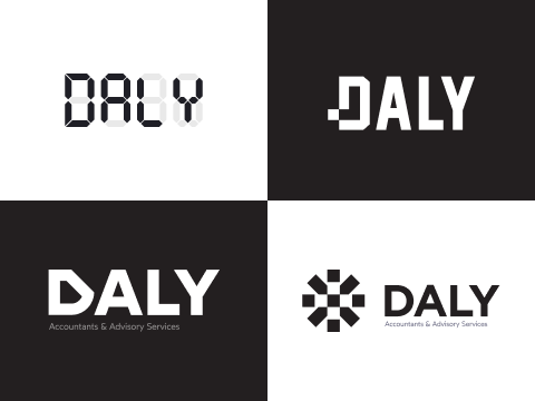
The final concept centred around eight squares arranged in a circular formation, symbolising a group or meeting. The individual squares could also be rearranged to create mathematical symbols (+, −, ×, ÷), introducing a subtle connection to accounting and finance.
One square is highlighted in the primary brand colour, representing the individual attention and focus Daly Accountants gives to each client.
Visual Identity
For the logotype, I selected Rubik, a contemporary geometric sans-serif typeface. Its clean, approachable letterforms complement the structured brandmark while maintaining a professional appearance.
Together, the typography and geometric symbol create a flexible, recognisable identity that communicates both the technical and personal sides of the business.







Outcome
The final identity brings together the key principles of Daly Accountants: trust, modern thinking and strong client relationships.
Rather than relying on traditional accounting imagery, the brandmark uses a simple geometric system to communicate a more meaningful story about the business.
The result is a clean, distinctive and versatile identity that positions Daly Accountants as a modern, approachable financial partner.