Teeling Podiatry
Creating a clean, approachable brand identity and accessible digital experience for a podiatry practice.
- Client
- Teeling Podiatry
- Role
- Brand/Web Designer
- Year
- 2026
- Disciplines
- Branding, Visual Identity, UI Design, Web Design
The brief
Teeling Podiatry needed a brand identity that reflected the professionalism of the practice while remaining welcoming and approachable to its clients.
Following initial discussions with the client, we established three core principles to guide the design: professional, clean and inviting.
The project involved developing a cohesive visual identity that could be applied across both print and digital materials, alongside a website that made it easy for clients to find information and book appointments.
Process
Discovery & Concept Development
I began by discussing the client's requirements, target audience and the overall impression they wanted the brand to communicate.
From there, I explored and presented a range of initial concepts, looking at typography, colour and different approaches to the visual identity. Following feedback, I selected the strongest direction and refined it into the final brand.
Visual Identity
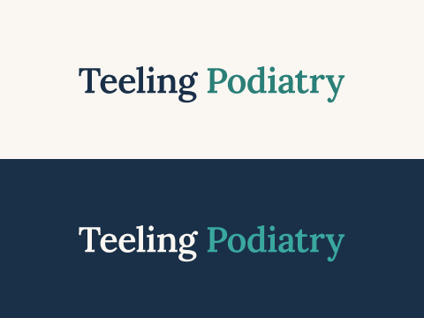
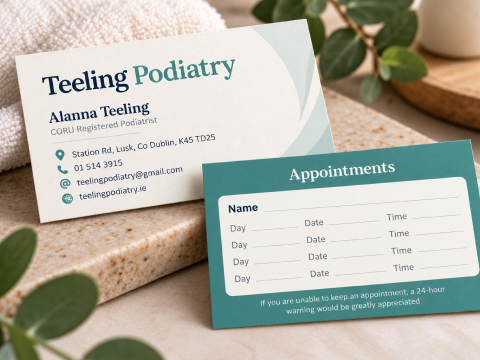
The final identity centres around a simple, typography-led logotype using Lora, a serif typeface that brings a sense of professionalism and warmth without feeling overly clinical.
I developed a restrained colour palette of teal, navy and cream, creating a clean, consistent visual system that feels trustworthy and approachable.
Rather than relying on obvious medical or foot-related imagery, the focus was on creating a distinctive identity through typography, colour and considered layouts.
Brand Application
With the visual identity established, I explored how it would translate across a range of marketing materials, including business cards, stationery and other branded touchpoints.
The aim was to ensure the identity remained consistent, recognisable and flexible across both physical and digital applications.
Website Design & Development
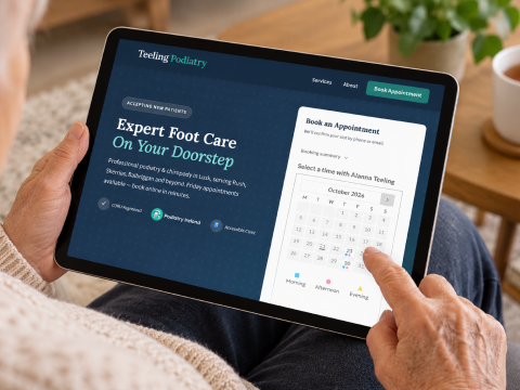
A key consideration for the website was accessibility and ease of use, particularly as older adults make up a significant proportion of the practice's clientele.
I designed and developed a simple, responsive, single-page website with clear navigation, readable typography and a straightforward content structure.
The appointment booking system was positioned above the fold, making it immediately accessible without requiring visitors to navigate through multiple pages or search for a booking link.
The overall approach was to remove unnecessary complexity and make the experience as intuitive as possible.

Outcome
The result is a cohesive brand identity and working website that reflect the practice's values across every touchpoint.
- Consistent visual identity: A refined logotype, colour palette and design system applied across print and digital materials.
- Audience-focused website: A clean, responsive experience designed with the needs of older users in mind.
- Simplified booking journey: Prominent appointment booking functionality that makes it easy for visitors to take action.
- Flexible brand system: A visual identity that can grow with the practice while maintaining a consistent, professional appearance.